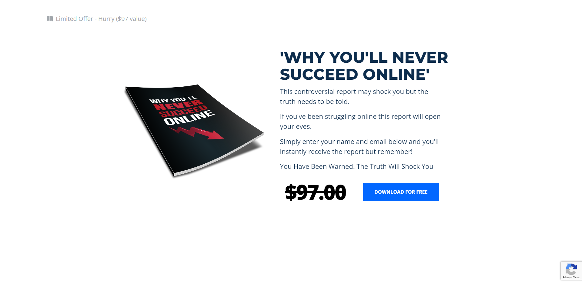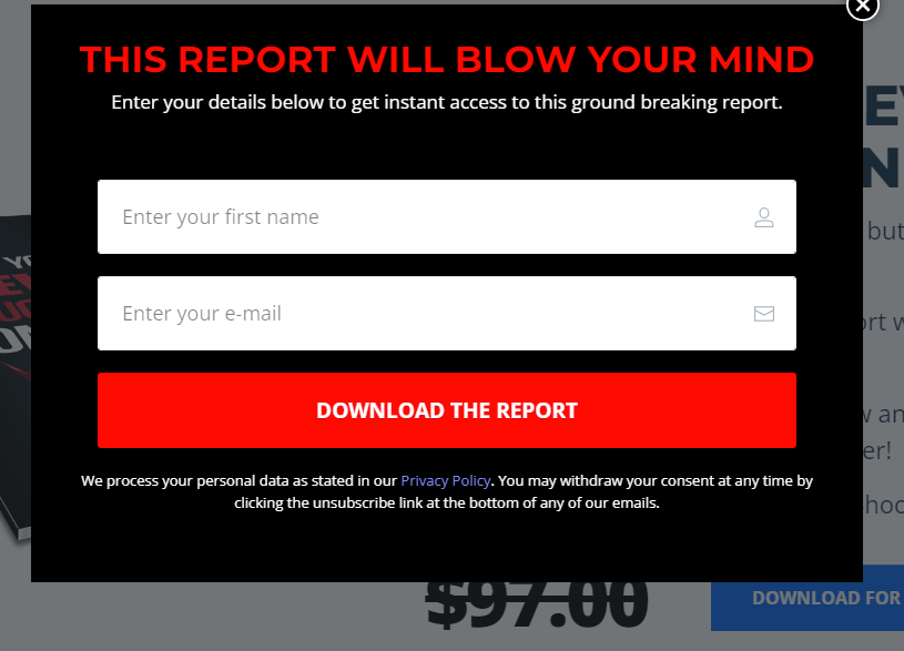

Opt-In
An opt-in page is a webpage designed to collect email addresses from visitors in exchange for something valuable. This is often called “opting-in” to a company’s email list. The purpose of an opt-in page is to build a list of email addresses that can be used for marketing and communication purposes.
Businesses and organizations typically use opt-in pages as part of their email marketing strategy. They may be used to promote a product, service, or event or to provide subscribers with valuable content such as newsletters, updates, or special offers.
Several elements are commonly found on an opt-in page. These include:
- A headline: This is the main message or offer presented to the visitor. The headline should be attention-grabbing and convey the value of opting in.
- A form: This is where the visitor enters their email address. The form may also include additional fields for collecting other information, such as name, phone number, or location.
- A call-to-action (CTA): is a button or link the visitor clicks to submit their email address and opt-in to the list. The CTA should be prominently displayed and use persuasive language to encourage the visitor to take action.
- A privacy policy: This statement explains how the company will use the visitor’s personal information. Including a privacy policy to build trust and ensure compliance with privacy laws is essential.
- A confirmation message: This is a message that is displayed to the visitor after they have successfully opted-in. It may include a thank-you message, a confirmation of the email address, or instructions on accessing the promised content.
There are several best practices to follow when designing an opt-in page:
- Keep it simple: An opt-in page should be focused and easy to understand. Avoid clutter and unnecessary distractions that could distract from the main message or offer.
- Make the offer clear: The visitor should know exactly what they will receive in exchange for their email address. This could be a free report, access to a webinar, or a discount code.
- Use persuasive language: The headline and CTA should use language that motivates the visitor to take action. Words like “free,” “limited time,” and “exclusive” can be effective in driving conversions.
- Use social proof: Including testimonials or logos of well-known companies can help build trust and credibility.
- Use mobile-responsive design: With more and more people accessing the internet via mobile devices, it is essential to ensure that the opt-in page is optimized for mobile viewing.
Conclusion
An opt-in page is a valuable tool for businesses and organizations looking to build their email list and engage with their audience. By following best practices and designing an effective opt-in page, companies can effectively collect email addresses and establish relationships with their subscribers.
